
Design Renewal for Coupang
A project that analyzed the issues of the online shopping app Coupang and renewed it in a user-friendly direction.
Company
Timeline
Platform
Discipline
App
User Research, UX Design, GUI Design, Branding
March 2021 - April 2021,
7 weeks
Coupang
With
Yoonju Jo(Professor), Chloe Youn, Solbi Kang, Seorin Lee
About the project
As part of the university interface design course, under the guidance of Professor Yoonju Jo, our project mentor, two team members and I conducted a design renewal of the e-commerce platform Coupang.
Coupang is a massive e-commerce company with 19 million users and ranks 7th in the app store shopping app rankings. However, with an App Store rating of 3.4 and a Google Play Store rating of 3.9, compared to an average rating of 4.5 for other similar shopping apps, the ratings are significantly lower. Moreover, analysis of Coupang's Voice of Customer revealed numerous negative opinions regarding app usability. Therefore, in this project, we aimed to identify and address the specific issues with Coupang's service to improve it overall.


User Research
We decided to conduct user research to specifically identify the inconveniences users may experience while using Coupang. Initially, we sent out surveys to understand the overall perception of Coupang. Then, we selected a few survey respondents for in-depth interviews to thoroughly examine the process of using Coupang and identify any issues.
Survey
We created a survey to identify the positive and negative aspects of the Coupang service as perceived by users. The overall process involved defining the survey objectives, designing and distributing the survey, and then analyzing the responses to derive insights. The survey targeted users who have used or are currently using the shopping app, and it was conducted for 10 days, with a total of 103 respondents.
The following are some key findings from the survey responses that we paid close attention to:
Coupang lacks clear brand identity colors.
Fast delivery is Coupang's biggest strength.
Unnecessary advertisements and excessive information listing are weaknesses of Coupang.


Interviews
Based on the survey, we identified the strengths and weaknesses of the Coupang service in broad terms. Next, to identify hidden issues in the process of using Coupang and derive improvement directions, we conducted interviews with users to examine the overall process of using the Coupang app. The interviewees were users who frequently used Coupang and were aged between their 20s and 50s, with a total of 17 interviews conducted.

Affinity Map
After completing the interviews, we used the affinity mapping method to group and extract common themes from the interview contents in order to derive key insights. Each interview content was categorized into positive, negative, and needs. We organized the interview content into raw data in Excel, then classified it into primary and secondary categories using Figma, and finally grouped it into eight major categories.
Home: Excessive product recommendations.
Information: Need for organizing information hierarchy.
Advertisements: Too many advertisements, need for personalized ads.
Category: Inconvenient visual recognition.
Notifications: Difficulty in turning notifications on and off.
Filters: Overly detailed search filters.
Reviews: Inconvenient review viewing.
Visual design: Inconvenient category design, inconsistent colors, rudimentary design.

Insights
After grouping the affinity map and organizing our thoughts, we were able to extract six key insights.

Mental Model
To understand the gap between what users want and what is currently provided, we conducted an additional process of patternizing user behaviors into a single model. Analyzing the interviews conducted earlier, we identified common behavioral patterns among users, grouped them into representative actions, and derived keywords. These keywords were then utilized as valuable ideas for improving app functionality.


Personas
Based on the results of observing the behavior patterns of the user group interviewed and the process of using the app, we created three personas representing various user archetypes. These personas encompass diverse usage scenarios to cater to potential customers who may use Coupang.


Journey Map
To derive an overall design solution, we created a journey map based on interviews and personas. We visualized the experiences users had while using the product to identify where they were encountering difficulties. This enabled our team to collaboratively pinpoint areas of focus and effectively set directions for improvement.
UX Concept
We defined a UX concept encapsulating the overall direction for service improvement, clarifying what valuable features we should provide to users.

Low-fi Wireframes
Before delving into the actual screen design, we first deliberated on wireframes and flows to establish a basic framework. As the original Coupang platform tended to overwhelm users with excessive information, we made efforts to simplify in the redesigned version. We concentrated on designing Low-Fi wireframes for interfaces that appropriately provide users with necessary information.

Style Guide
We decided on a style guide to ensure a consistent brand experience and uniformity in UI. Based on the findings from our surveys and interviews, users were not clear on what Coupang's brand colors were. Therefore, we defined a new brand color. Since Coupang's Rocket Delivery service is its most famous and distinctive advantage, we chose blue, symbolizing Rocket Delivery, as the brand color. All application icons, logos, and icons used within the app were redesigned to align with the new brand color.
Colors
Primary

Neutrals

Secondary

Typography

Application Icon

Logo

Icon

Icon
I believed that the brand identity should be reflected in the icons used within the app to provide users with a consistent brand experience. Therefore, I designed icons that incorporated the characteristics of the Coupang logo. Analyzing unique features such as the thickness of straight lines, curvature of curves, rounding of logo alphabet corners, and the aspect ratio of 1:1.25 for vertically elongated shapes, I created icons for the bottom tab bar and categories to reflect these elements.


Design
To increase the accuracy of the product recommendation service and enable personalized recommendations, we conducted a user preference survey when users installed the app and first entered it. The options chosen can be reselected in the settings later on.
Onboarding Survey

While redefining the brand colors, we adjusted the overall tone of the screen elements to ensure consistency. Additionally, we simplified the category icons to enhance visual clarity.
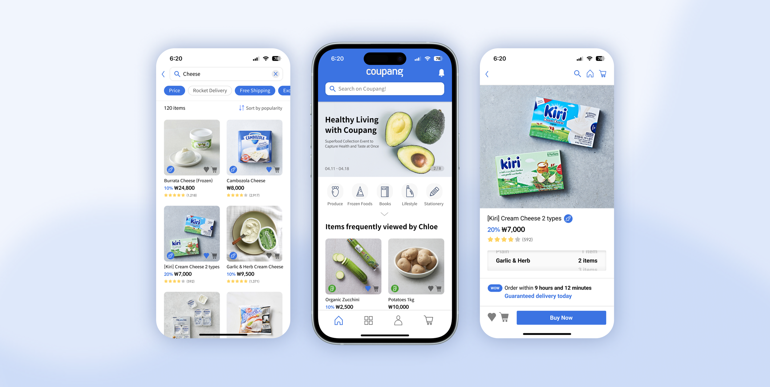
Home

The product recommendations on the home screen are tailored to users based on the results of the earlier user preference survey, providing a personalized recommendation service. Additionally, we redesigned the interface to allow users to add items to their cart and like them without having to enter the detailed product page when viewing the product list.

The original notification on/off settings were inconvenient for users due to the complex process of navigating through My Page - My Info Management - Settings. To address this, we relocated the notification on/off option directly on the home screen for easier access.
Additionally, we categorized notifications by type to enable users to quickly find the notifications they desire, ensuring overall content clarity and ease of comprehension.
Notification

The category screen is organized according to the priority of features, emphasizing Rocket Delivery, Rocket Direct Purchase, and Rocket Fresh, which are the most frequently used functions by users. Overall, we increased the size of category icons to ensure quick visual recognition and adjusted the overall tone for consistency.
Category
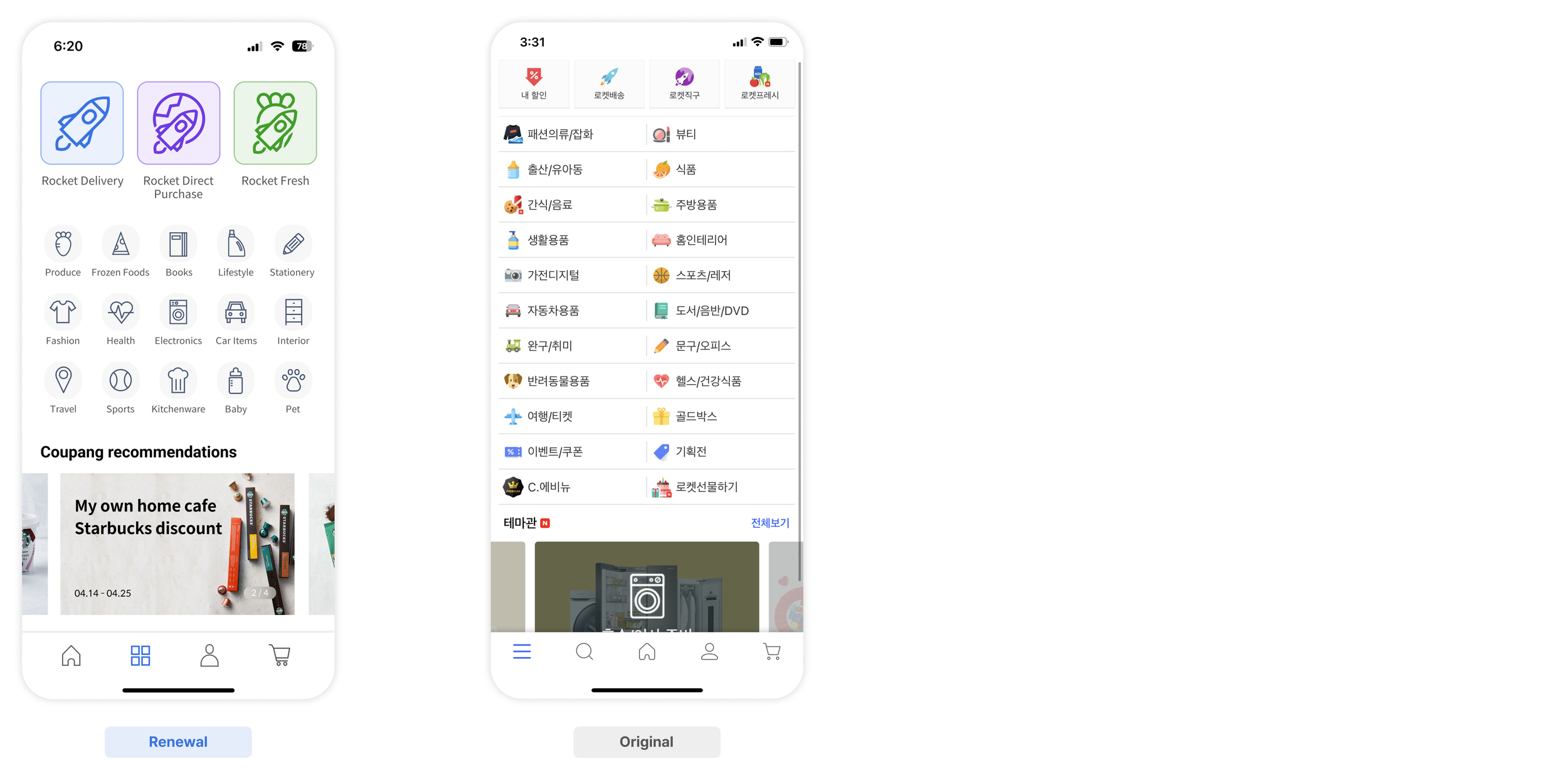
The original home screens for Rocket Delivery, Rocket Direct Purchase, and Rocket Fresh lacked consistency in layout despite offering similar services, failing to provide users with a consistent UX experience. As a solution, we unified the layout and structure of information across all three service home screens.
Furthermore, while the original detailed category order for each service was the same for all users, in the redesigned version, it has been changed to personalized recommendation categories, presented in the order of categories users frequently use.
Main feature home

Originally, there were over 20 options in the filters, which users felt were too many compared to the filters they frequently used. Therefore, we compressed the essential filters that are frequently used without additional depth and placed them under the search bar.
Additionally, since users consider product prices important when making purchases, we introduced a new graphical price range filter that allows users to intuitively set the price range of products.
Filter

Originally, users had to choose quantity and flavor on an additional page, but we deemed this process cumbersome for users and considered it unnecessary. As a solution, we changed it to a scroll format on the screen, allowing users to select flavor and quantity simultaneously.
Quantity selection

The reviews, which were originally in paragraph format, had the problem of low information conveyance. To address this, we redesigned the reviews by structuring them with titles and keywords in the thumbnail view, enabling users to quickly grasp the review information.
Customer reviews

Lessons Learned
Working on this project with my teammates was truly rewarding, and as a designer, it has helped me grow in various aspects. In particular, conducting interviews with users and listening to their stories, as well as improving features based on them, allowed me to learn how to pay attention to the users' voices and create better services. Additionally, The process of redesigning the existing service made me ponder countless times on how to design it so that users can reach their desired goals without obstacles. lastly, through weekly critiques, I learned how to effectively communicate the design process to others.
I express my sincere gratitude to our professor for leading this entire project so wonderfully.